Monday, 20 November 2017

Production- Editing


As mentioned in my previous blog post, I don't have as much usable footage for the second verse and chorus, than the first verse and chorus, because the second star was not very good at lip syncing. This is making the editing process much more difficult, as I am less likely to find footage that will fit with the rhythm/lyrics. As a result, I have to become more creative in the way I edit my footage so that this verse and chorus can be completed, whilst maintaining a high standard of aesthetic pleasure.

I have also looked at more Kpop videos for editing inspiration. 'I Got Love' by Taeyeon has interesting patterns and rhythms in the music video that accompany the song. If a part of the music video particularly caught my eye, I would slow down the video and observe the shot length, the behaviour of the camera movement and the special effects used. I would also use this same process for other music videos.


Lots of extremely short cuts with  glitch effects


Negative overlay
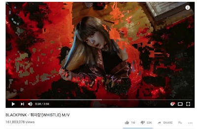


Glitch effect 


The three media texts above, from three different Kpop videos, inspired this shot sequence:


Music video snippet from i Browse on Vimeo.

Friday, 17 November 2017

Production- Editing

 Creating cohesion with lighting 


Unfortunately, the star (pictured above) was less able to lip-sync and consequently, I found it much harder to find sufficient footage for his lip-syncing shots. Therefore, I am using more cutaways and footage where this star is not lip-syncing. 


  Above is a screenshot of usable footage of my artist lip syncing. This shot shortly follows the shot (first pictured) and so, in order to create flow in my music video I altered the lighting on iMovie to produce the below: 


Not only does changing the lighting create cohesion, but it also provides relief of the large use of red shots.

Monday, 13 November 2017

Production- Editing


Reflecting on my audience feedback, I have added more cutaways to break up the constant red shots and I have also changed the the red and green gain to 0% to create the illusion that the shot was taken with blue lighting (pictured above). I find that these changes has made the music video so far, less monotonous and more engaging to consume.

Sunday, 12 November 2017

Generic Research- Richard Dyer Star theory

Here are some of the main points that I picked up when looking at media know all for information on Richard Dyer's Star theory that I will take into consideration when constructing the representation of my artist.

Stars are constructed, artificial images, even if they are represented as being "real people", experiencing real emotions etc. It helps if their image contains a USP — they can be copied and/or parodied because of it. Their representation may be metonymic — Madonna's conical bra in the early 1990s, Bono's 'Fly' sunglasses, Britney's belly, Justin Bieber's bangs. Pop stars have the advantage over film stars in that their constructed image may be much more consistent over a period of time, and is not dependent on the creative input of others (e.g. screenwriters writing their lines).

Dyer proposes that:

A star is an image not a real person that is constructed (as any other aspect of fiction is) out of a range of materials (eg advertising, magazines etc as well as films [music]).


Industry and Audience
Stars are manufactured by the music industry to serve a purpose — to make money out of audiences
Dyer says:

Stars are commodities produced and consumed on the strength of their meanings.

Ideology & Culture
Stars represent shared cultural values and attitudes, and promote a certain ideology. Audience interest in these values enhances their 'star quality', and it is through conveying beliefs ideas and opinions outside music that performers help create their star persona. A star may initiate a fashion trend, with legions of fans copying their hairstyle and clothing.

Friday, 10 November 2017

Planning- Flat-plan Magazine Poster

This is the flat-plan that I have created for my magazine poster advertising the artist's album. I decided to emulate NCT album poster as I want to create a similar representation of a young, artistic, well-established artist. 


Thursday, 9 November 2017

Planning- Flat-plan for Digi-pack

Below is the flat-plan for my digipack. I have applied a mixture of codes and conventions from digipacks and Kpop albums that I identified during research such as having the tracklist, record company logos and terms and conditions of the back cover and using or slightly altering the image (I'm using a picture of an orchid) on the front cover for the CD. I am considering creating a photobook/photo cards along with the digipack so that my product truly feels as if it belongs to the Kpop genre- as this is a feature unique to Kpop albums

Production- Audience Feedback


After showing some people my music video so far, it was brought to light that there is too many shots with strong neon and red lighting which makes it less engaging. Therefore, to make it more engaging, I will break up the consistency using cutaways filmed in the Hill Garden and Pergola. Also, to make my music video more aesthetically pleasing, I will create a pattern in the order of my shots.  

Wednesday, 8 November 2017

Production- Digipack front cover

I was not satisfied with the album front covers that I had made so far and therefore created some new designs. The pictures below are placed in chronological order, showing the development of my ideas. I feel that these designs are much more aesthetically pleasing and adhere more strongly to the codes and conventions of KR&B album covers shown in my mood board


Tuesday, 7 November 2017

Production- Digital Covers


This lesson I experimented in photoshop and indesign, creating a digital cover for my artist.

Monday, 6 November 2017

Production- Pictures for Ancillary Products


While filming some more cutaways for my music video, I also took pictures for my website. I liked this picture and I thought that the composition was sufficient for an album cover or as the background of my website etc. Therefore, I will recreate this picture but with a more relevant subject.

Isabella Browse Candidate number: 3610 Centre Number: 16607